Henry Hargreaves
Brand Identity & Typography
Finalist ︎ Best Awards 2019
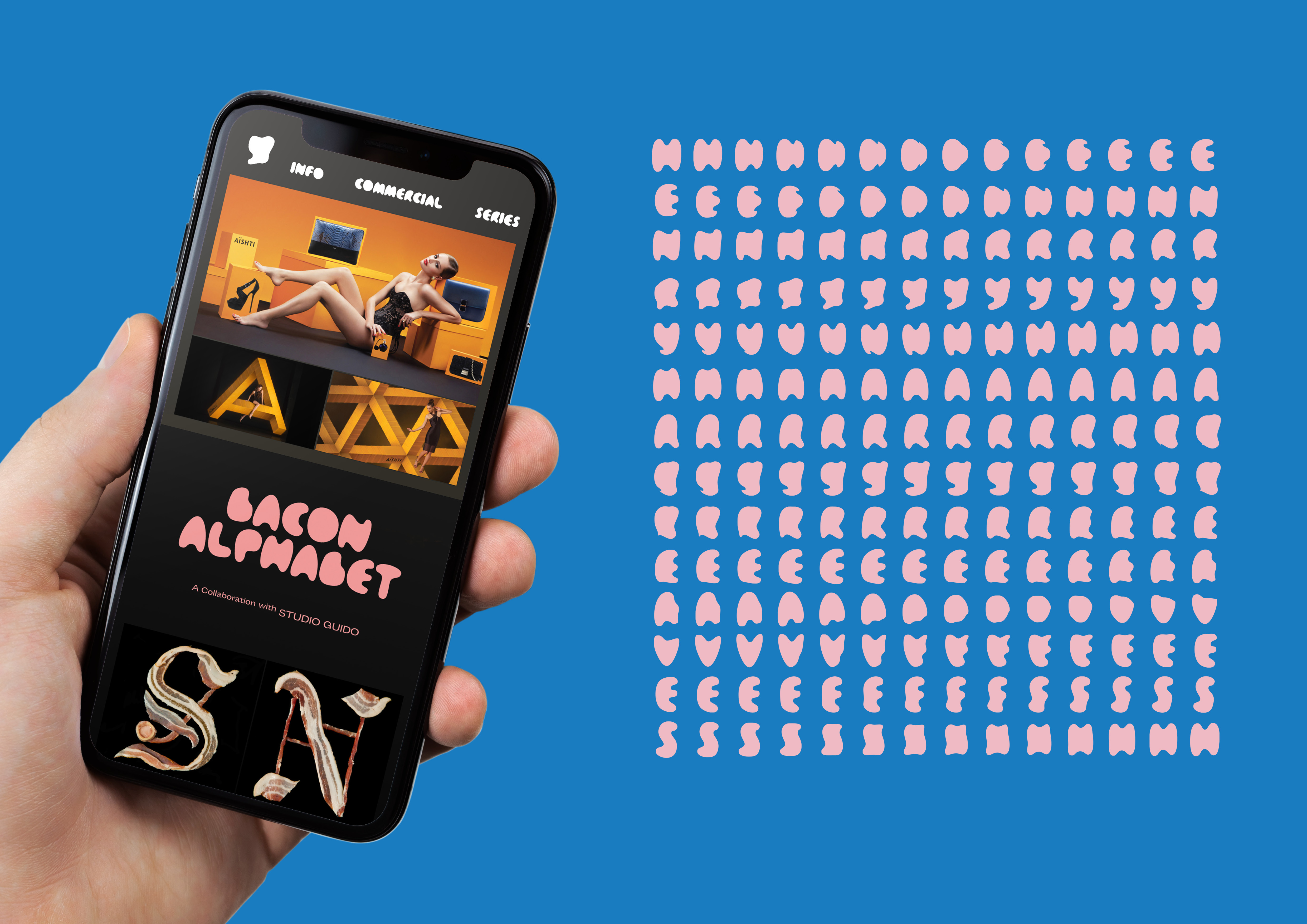
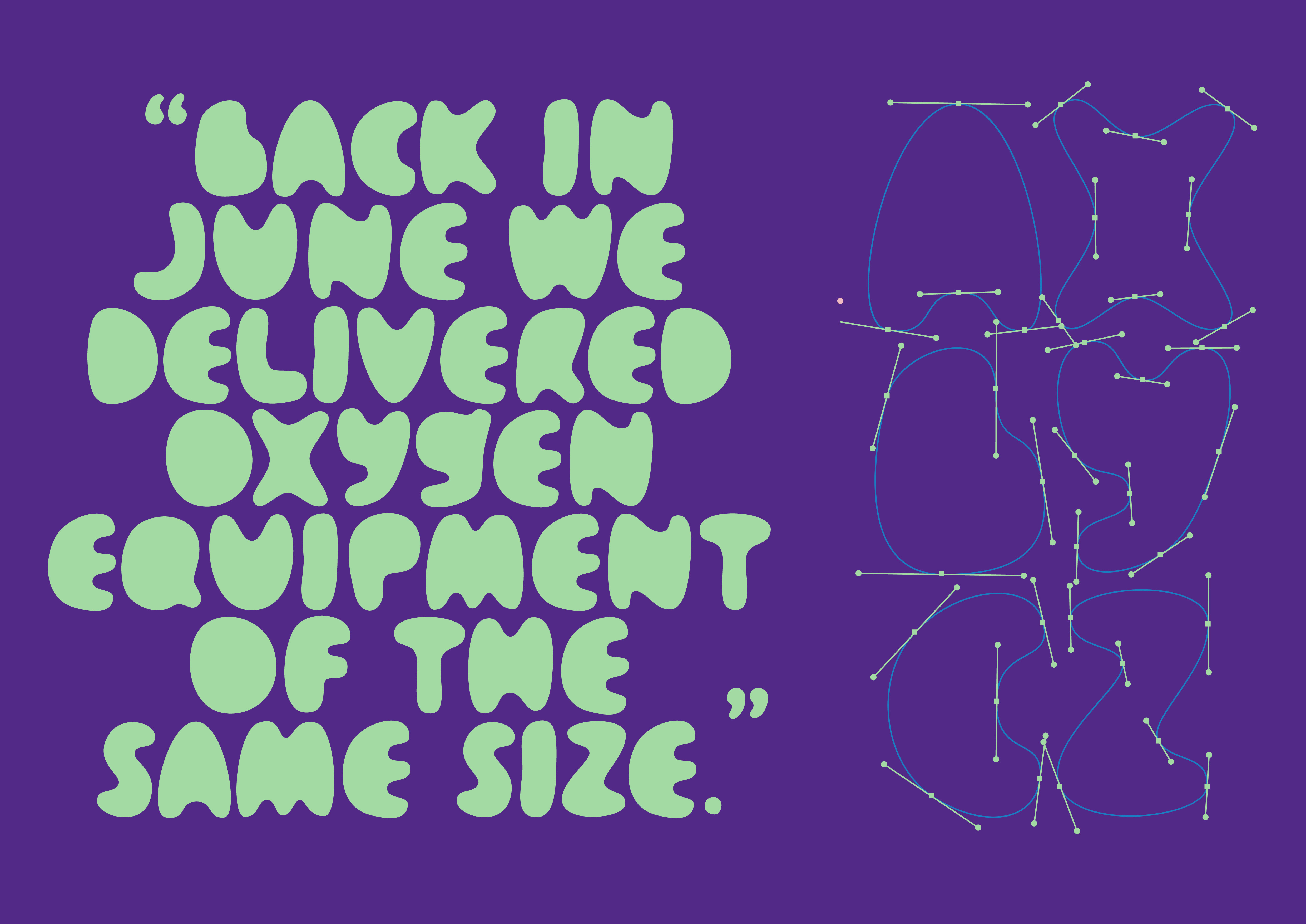
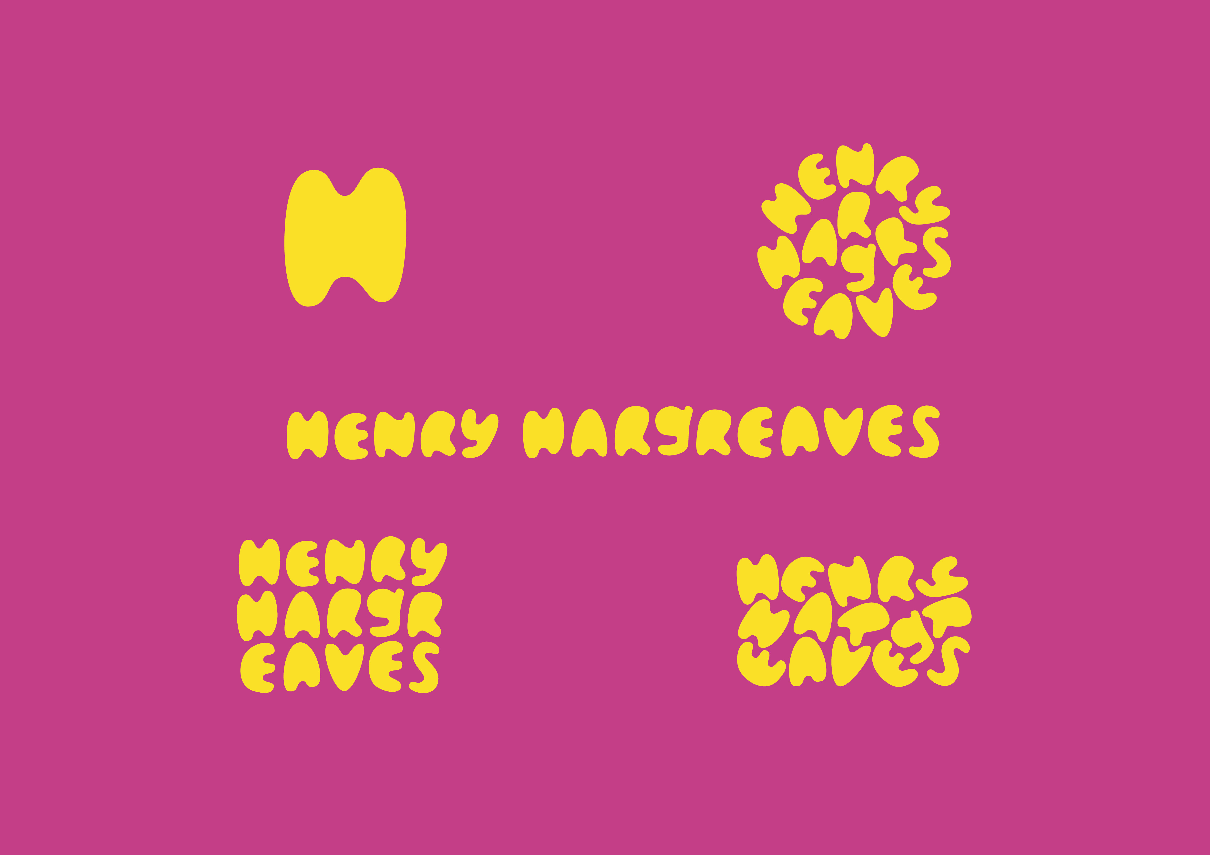
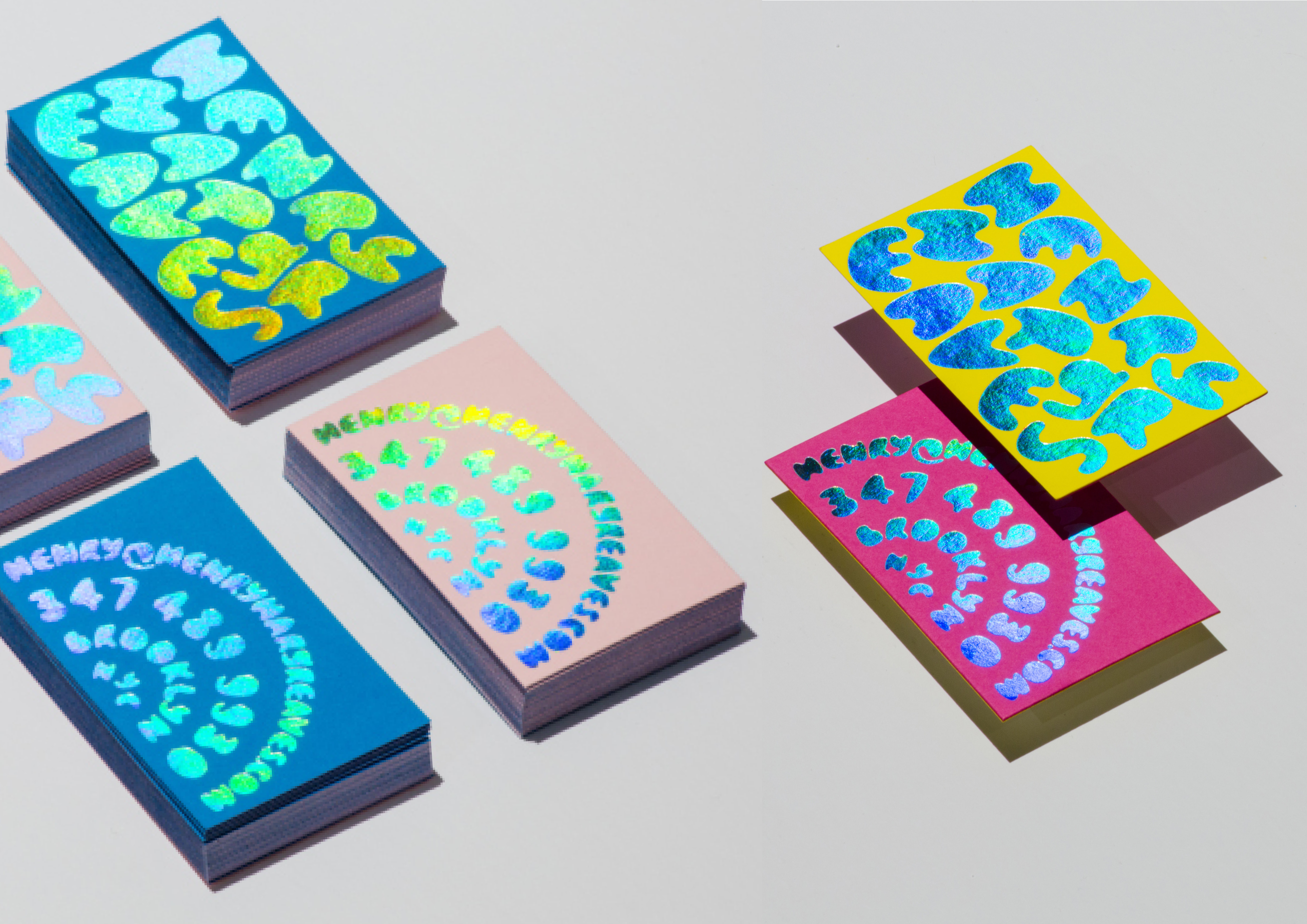
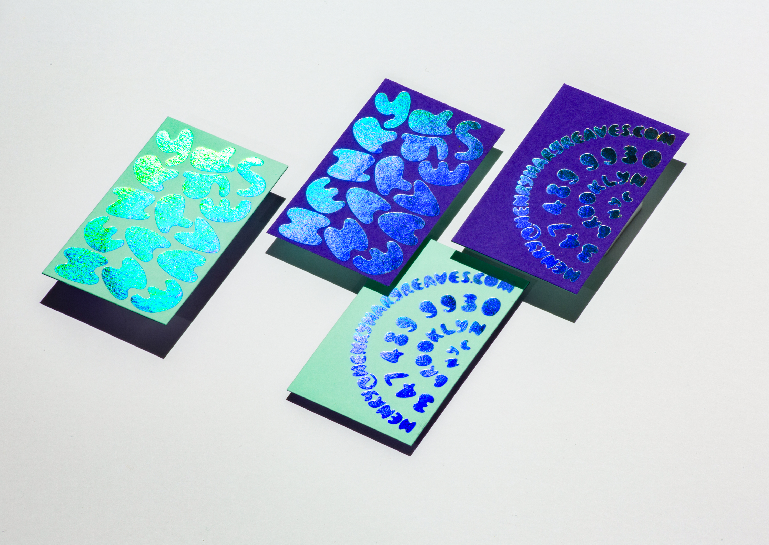
Henry Hargreaves explores food through photography. I decided to express Henry’s practice through typography, each letter of the alphabet resembling a piece of dough.
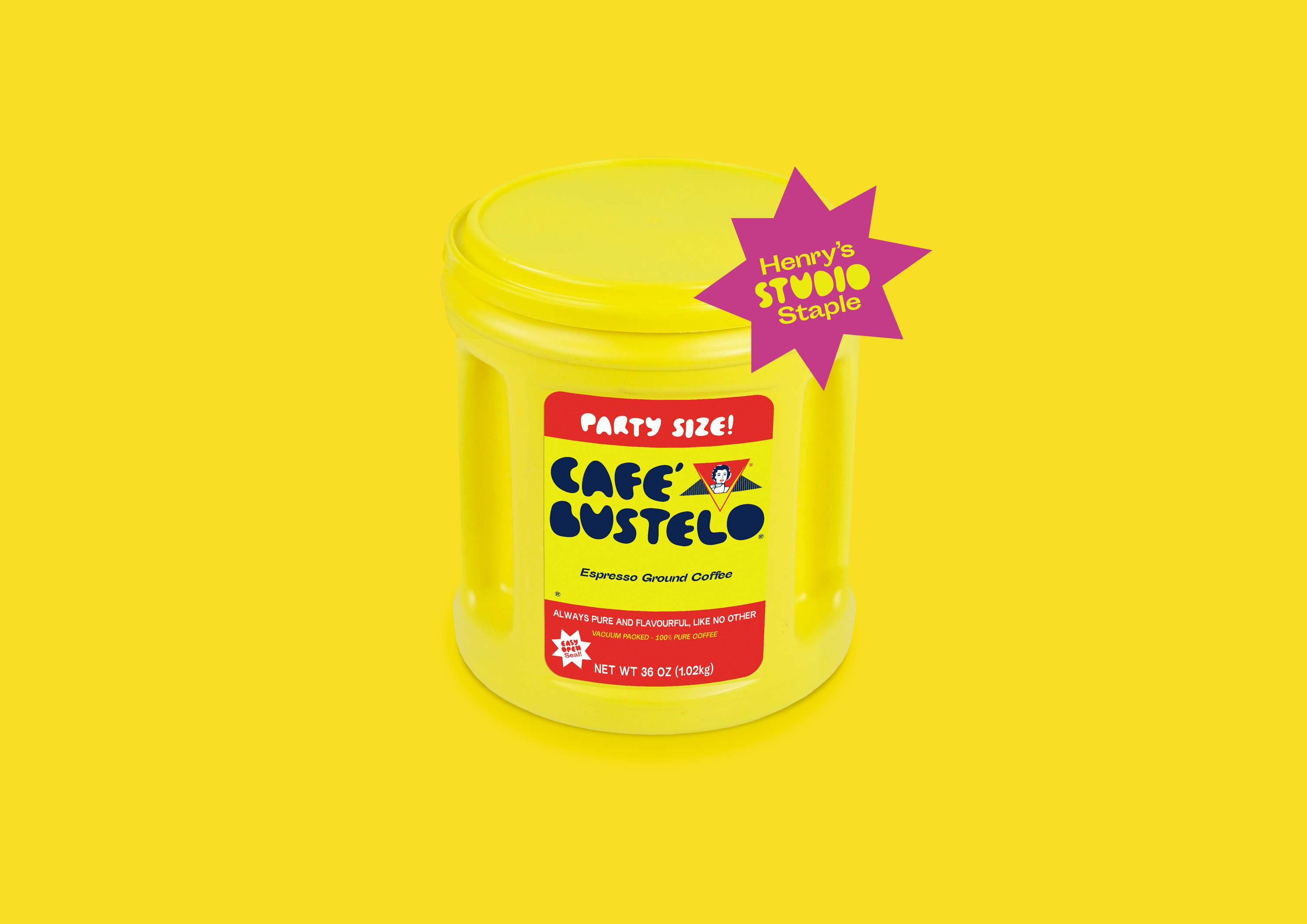
We chose five candy coloured pairings for his buisiness cards... not even Henry’s sure which card he will pull out of his pocket.
Brand Identity & Typography
Finalist ︎ Best Awards 2019
Henry Hargreaves explores food through photography. I decided to express Henry’s practice through typography, each letter of the alphabet resembling a piece of dough.
We chose five candy coloured pairings for his buisiness cards... not even Henry’s sure which card he will pull out of his pocket.